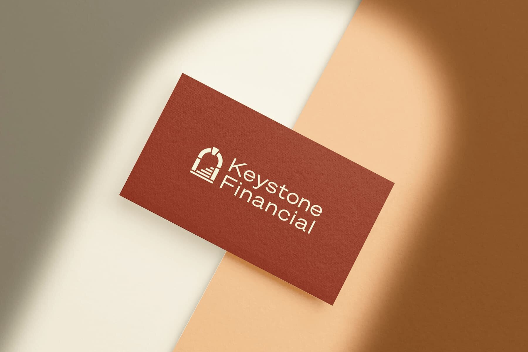
Keystone Financial Rebrand
2019 saw our 10th anniversary, which was a major milestone for Keystone, as it is for any business. This led us to reflect on how much has changed and how we have grown, professionally as well as in numbers, over that 10 years.
It became apparent that we hadn’t looked at our branding much since the very beginning. As with many businesses, we had spent a lot of time working IN the business, and not much working ON it!
There was nothing wrong with the existing branding. The website did what was required and provided basic information on the firm for anyone who cared to look. But it didn’t really reflect what we have become.
We have evolved hugely in the last 10 years, and felt it was time to ensure our website and logos better reflected our approach and our determination to provide a far more human service to our advisers and clients alike, than other firms.
It was a revealing process where our man Tom at guvnor.co really helped us peel back the layers to see what Keystone really is, well beyond what services it offers, and right down to the ethos of the firm and its members.
It’s very difficult to put into words what we are when we have no real competitors to draw upon. What we do is quite different to other firms out there. We did look at other websites in our field and agreed immediately that they all look pretty much the same. Very blue and full of computer screens with smiling office people around them. All of this was a million miles from Keystone!
We hope you will agree that the end result reflects the humanist attitude we have toward our work. Take your time and have a good look around the site and do feel free to send us feedback using the contact pages. We really would love to hear from you.

